BLOCK & INLINE ELEMENTS
Every HTML element has a default display value, depending on what type of element it is. There are two display values: block and inline.
CONTENT MODEL
Generally, block-level elements may contain inline elements and (sometimes) other block-level elements. Inherent in this structural distinction is the idea that block elements create "larger" structures than inline elements.
DEFAULT FORMATTING
The distinction of block-level vs. inline elements was used in HTML specifications up to 4.01. In HTML5, this binary distinction is replaced with a more complex set of content categories.
While the "inline" category roughly corresponds to the category of phrasing content, the "block-level" category doesn't directly correspond to any HTML5 content category, but "block-level" and "inline" elements combined together correspond to the flow content in HTML5. There are also additional categories, e.g. interactive content.
BLOCK LEVEL ELEMENTS
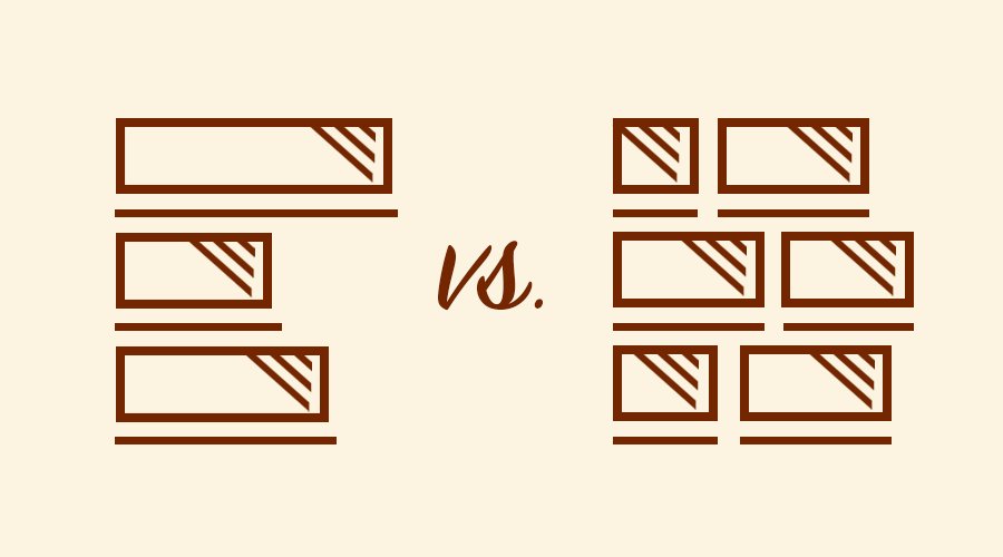
Block level elements take up as much space as possible by default. Each block level element will start a new line on the page, stacking down the page. In addition to stacking vertically, block level elements will also take up as much horizontal space as possible.
The p element is an example of a block level element. Each new paragraph tag will appear on its own line vertically. Paragraphs with longer content will stretch all the way to the edge of the page.
INLINE ELEMENTS
Inline elements display in a line. They do not force the text after them to a new line. An anchor (or link) is an example of an inline element. You can put several links in a row, and they will display in a line.
CSS GRID & FLEXBOX LAYOUTS
Our comprehensive guide to CSS flexbox layout. This complete guide explains everything about flexbox, focusing on all the different possible properties for the parent element (the flex container) and the child elements (the flex items).
FLEXBOX LAYOUT
The flexbox layout (flexible box) module a W3C Candidate Recommendation as of October 2017) aims at providing a more efficient way to lay out, align and distribute space among items in a container, even when their size is unknown and/or dynamic (thus the word “flex”).
The main idea behind the flex layout is to give the container the ability to alter its items’ width/height (and order) to best fill the available space (mostly to accommodate to all kind of display devices and screen sizes). A flex container expands items to fill available free space or shrinks them to prevent overflow.
THE GRID LAYOUT
Since flexbox is a whole module and not a single property, it involves a lot of things including its whole set of properties. Some of them are meant to be set on the container (parent element, known as “flex container”) whereas the others are meant to be set on the children (said “flex items”).
If “regular” layout is based on both block and inline flow directions, the flex layout is based on “flex-flow directions”. Please have a look at this figure from the specification, explaining the main idea behind the flex layout.
CONTENT SIDEBAR LAYOUT
This defines the alignment along the main axis. It helps distribute extra free space leftover when either all the flex items on a line are inflexible, or are flexible but have reached their maximum size. It also exerts some control over the alignment of items when they overflow the line.
ORDINARY SIDEBAR
Note that that browser support for these values is nuanced. For example, space-between never got support from some versions of Edge, and start/end/left/right aren’t in Chrome yet. MDN has detailed charts. The safest values are flex start.
There are also two additional keywords you can pair with these values: safe and unsafe. Using safe ensures that however you do this type of positioning, you can’t push an element such that it renders off-screen (e.g. off the top) in such a way the content can’t be scrolled too (called “data loss”).
WIDGETIZED SIDEBARS
Flexbox requires some vendor prefixing to support the most browsers possible. It doesn’t just include prepending properties with the vendor prefix, but there are actually entirely different property and value names. This is because the Flexbox spec has changed over time, creating versions.
Perhaps the best way to handle this is to write in the new (and final) syntax and run your CSS through Autoprefixer, which handles the fallbacks very well.
Alternatively, here’s a Sass @mixin to help with some of the prefixing, which also gives you an idea of what kind of things need to be done:
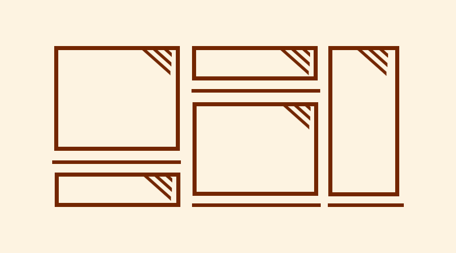
12 COLUMNS BOOTSTRAP GRID
Use our powerful mobile-first flexbox grid to build layouts of all shapes and sizes thanks to a twelve column system, six default responsive tiers, Sass variables and mixins, and dozens of predefined classes.
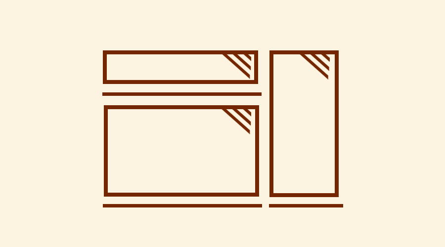
ONE COLUMN GRID
Auto-layout for flexbox grid columns also means you can set the width of one column and have the sibling columns automatically resize around it. You may use predefined grid classes (as shown below), grid mixins, or inline widths. Note that the other columns will resize no matter the width of the center column.
CONTAINERS
Containers are the most basic layout element in Bootstrap and are required when using our default grid system. Containers are used to contain, pad, and (sometimes) center the content within them. While containers can be nested, most layouts do not require a nested container.
BREAKPOINTS
Bootstrap includes six default breakpoints, sometimes referred to as grid tiers, for building responsively. These breakpoints can be customized if you’re using our source Sass files.
Desktop layout
Developers are also likely to be pleased with the simplified syntax for doct structuring. Lots of tags have been implemented that are clear, simple and do what they say.

Tablet layout
This more semantically natural approach should also make it a lot easier for new developers to learn to code websites as HTML5 represents a user-friendly markup.

Mobile layout
Another key considerations implemented in HTML5 has been developing for mobile on websites. The simplified syntax reduces the amount of overall code loaded.

David Russo
Proin gravida nibh vel velit auctor aliquet enean sollicitudin, lorem quis bibendum auctor, nisi elit consequat ipsum, nec sagittis uis sed odio sit amet nibh vulputate cursus a sit amet mauris. Morbi accumsan ipsum velit. Nam nec tellus a odio tincidunt auctor a ornare sed non mauris vitae erat consequat auctor eu in elit taciti sociosqu ad litora.

Jake Smith
Proin gravida nibh vel velit auctor aliquet enean sollicitudin, lorem quis bibendum auctor, nisi elit consequat ipsum, nec sagittis uis sed odio sit amet nibh vulputate cursus a sit amet mauris. Morbi accumsan ipsum velit. Nam nec tellus a odio tincidunt auctor a ornare sed non mauris vitae erat consequat auctor eu in elit taciti sociosqu ad litora.

Marie Holmes
Proin gravida nibh vel velit auctor aliquet enean sollicitudin, lorem quis bibendum auctor, nisi elit consequat ipsum, nec sagittis uis sed odio sit amet nibh vulputate cursus a sit amet mauris. Morbi accumsan ipsum velit. Nam nec tellus a odio tincidunt auctor a ornare sed non mauris vitae erat consequat auctor eu in elit taciti sociosqu ad litora.

Bobby Hasson
Proin gravida nibh vel velit auctor aliquet enean sollicitudin, lorem quis bibendum auctor, nisi elit consequat ipsum, nec sagittis uis sed odio sit amet nibh vulputate cursus a sit amet mauris. Morbi accumsan ipsum velit. Nam nec tellus a odio tincidunt auctor a ornare sed non mauris vitae erat consequat auctor eu in elit taciti sociosqu ad litora.

Jane Smith
Proin gravida nibh vel velit auctor aliquet enean sollicitudin, lorem quis bibendum auctor, nisi elit consequat ipsum, nec sagittis uis sed odio sit amet nibh vulputate cursus a sit amet mauris. Morbi accumsan ipsum velit. Nam nec tellus a odio tincidunt auctor a ornare sed non mauris vitae erat consequat auctor eu in elit taciti sociosqu ad litora.